Therr is a mobile/web app that utilizes geo-fence technology to help businesses/users create content and advertise, locally. Working with Therr was an enriching experience which allowed me to work alongside developers to quickly iterate releases. The design journey includes:
Part 1
Improving Content Creation Core UX
Simplifying the content creation flow makes it less intimidating/confusing to new users. Usability testing can validate design decisions before development resources are committed.
What is the problem?
The previous map screen had a lot of competing elements that obscured the main content creation CTA. In addition, there were a number of improvement opportunities for the FAB menu and content creation forms:
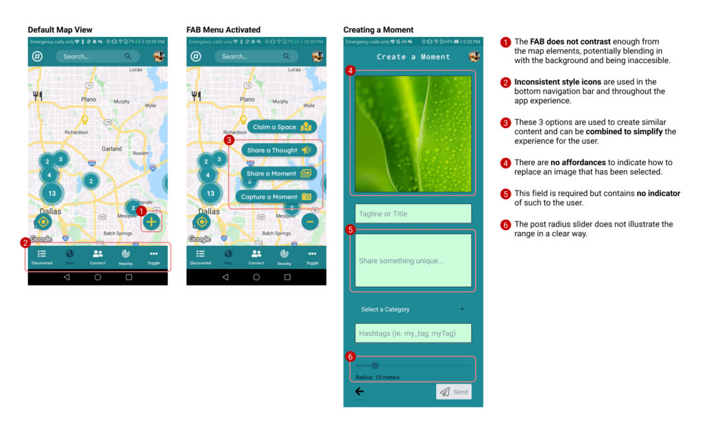
🔍 Previous content creation flow with improvement opportunities highlighted.
Process
I worked with the developer to understand the intent of the flow. Through iteration and feedback I designed a prototype that underwent multiple rounds of usability testing to optimize its design. Methods included testing with a click-through prototype, 5-second tests, A/B preference testing, SEQ questionnaires, and open ended surveying.
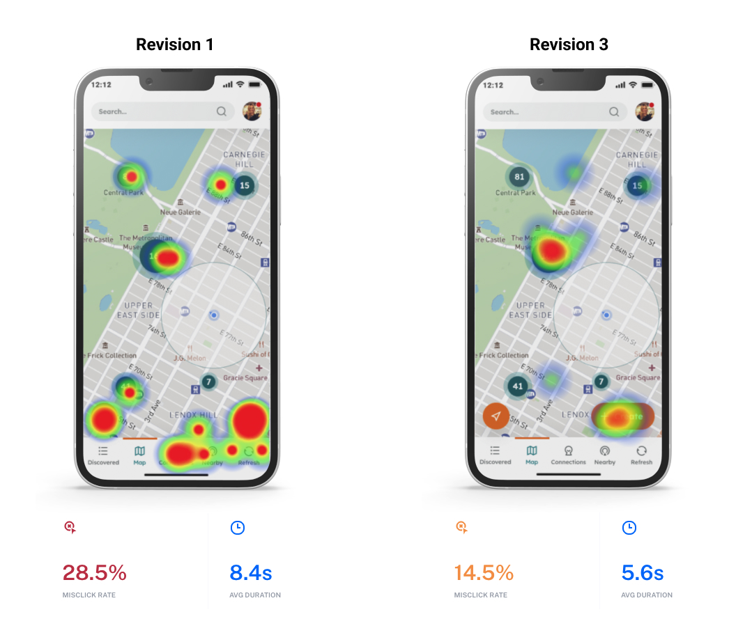
Heatmap comparison between the first revision and third revision showing improvement in misclick rate and user click-through speed.
Through iteration and user testing, we were able to track and improve a number of critical metrics, including:
Users recruited to participate in usability testing
Reduction in misclick rate
(28.5% to 14.5%)
Seconds of improvement in user speed
(8.4s to 5.6s)
Improvement to the SEQ score (4.9 to 5.67)
Solution
After validating the design through user testing, we felt more comfortable moving forward with the design update, which includes:
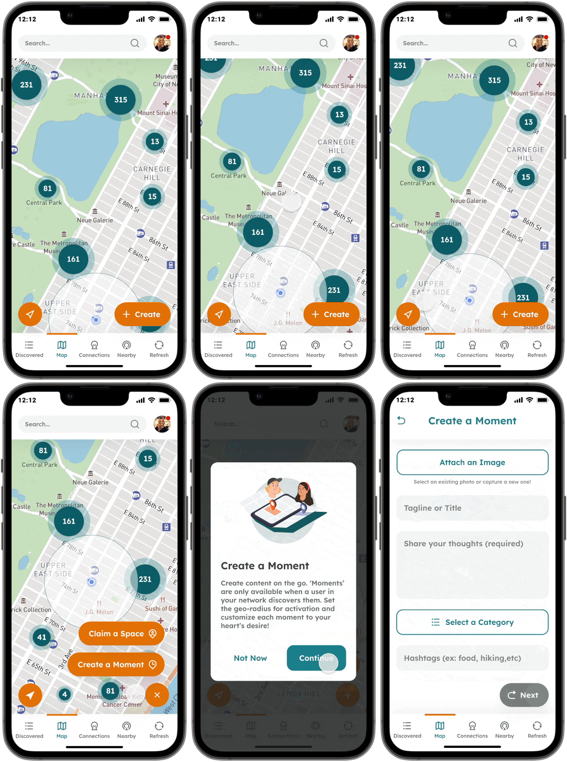
Map screen improvement
Users can now view the FAB menu more easily against a colorful background. The content creation options have also been simplified and includes a new informational modal.
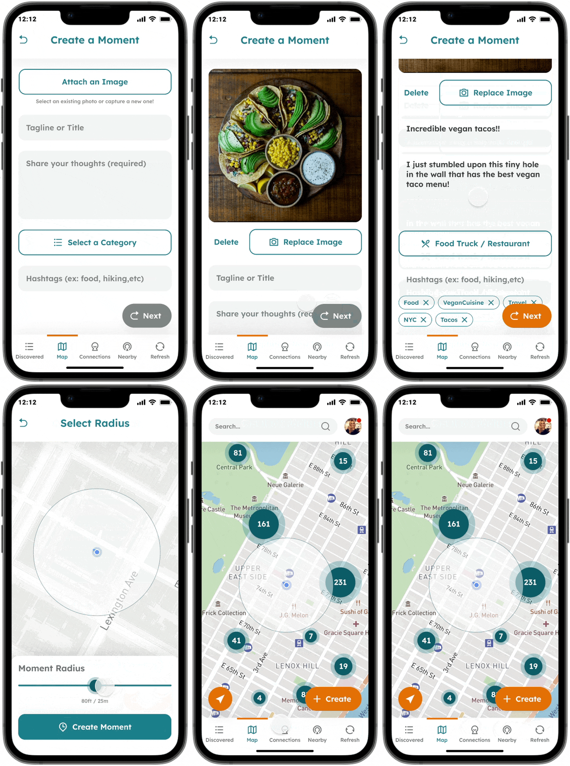
Content creation
Users can now replace images more easily and understand which fields are required. a new radius page provides users with visual feedback in addition to the slider.
What did I learn?
Seemingly simple changes can make large impacts on the usability of a product and working alongside with the developer helped me understand what design decisions will require more/less resources. Finding opportunities to perform user testing to validate these metrics is a great way to get feedback before any development resources are utilized.
Working with the founder/developer directly was an incredible experience for me and provided value to the company:
“Vy is a classic case of ‘the student becomes the teacher.’ He quickly adapted to our company vision and was able to deliver cohesive designs that moved us forward in leaps and bounds. He’s an expert at stepping into the user’s mind and asking the right questions during user testing. Along with creating great design work, he is also enjoyable to work with and a very fast learner.”
Zack A.
CEO/Founder @ Therr
Part 2
Invitations/Connections
As an early stage startup, diversifying the methods of inviting users will help Therr achieve its critical goals of increasing its user base.
What is the problem?
There were a few main problems that were identified with the previous design:
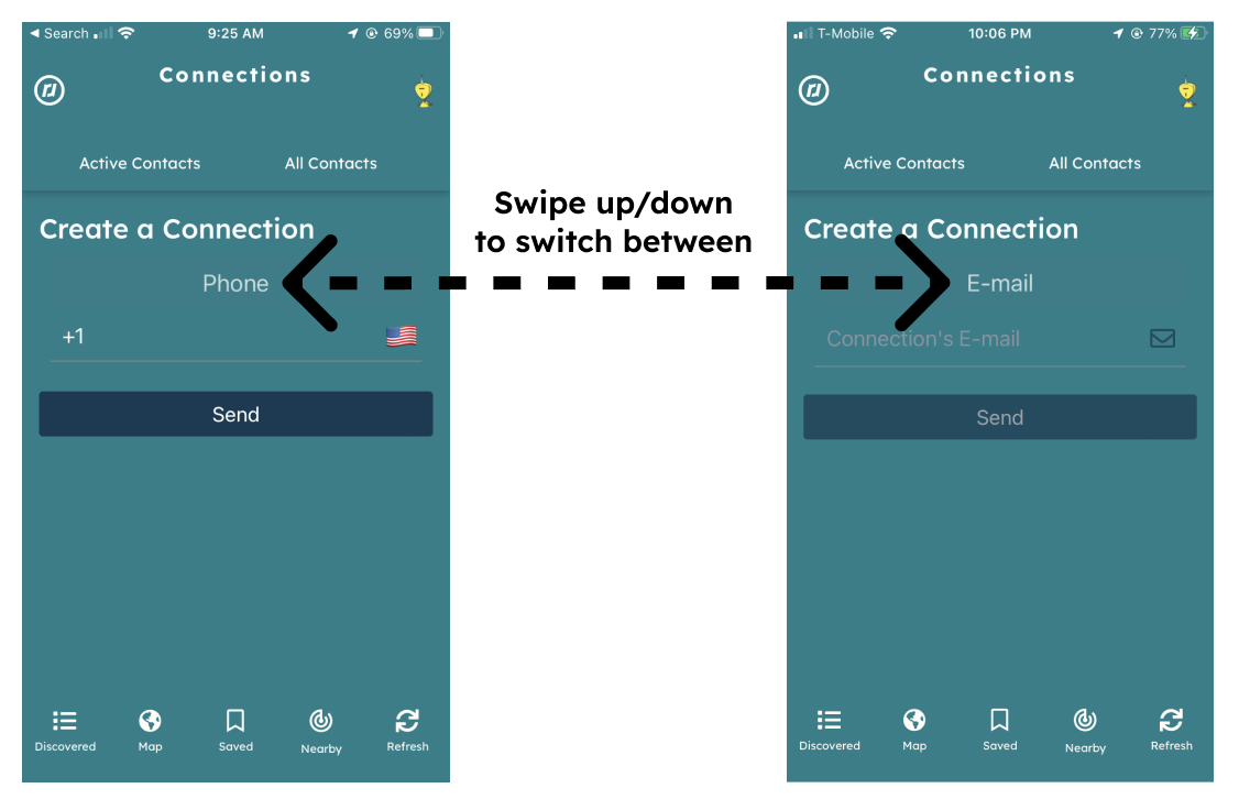
Previous design showing limited invitation options and un-intuitive UX.
Process
To solve these problems, we proposed that the design solution should:
With these goals in mind, we created a prototype and performed a usability test to understand how they would address these goals. Based on user feedback we found that 70% of users preferred to use a share link that they can send through apps Instagram, Facebook Messenger, or Whatsapp.
Instagram. I don’t have to grant access to my contact list. Also, I don’t remember numbers and email addresses. So the first option is most convenient.”
–User survey response to “Which invitation option are you most likely to use?“
Solution
Based on user feedback, we iterated on the proposed solutions shown below which address the goals we specifically targeted:
Offering options
In addition to the standard email invite, users will also be able to share a link through their preferred medium.
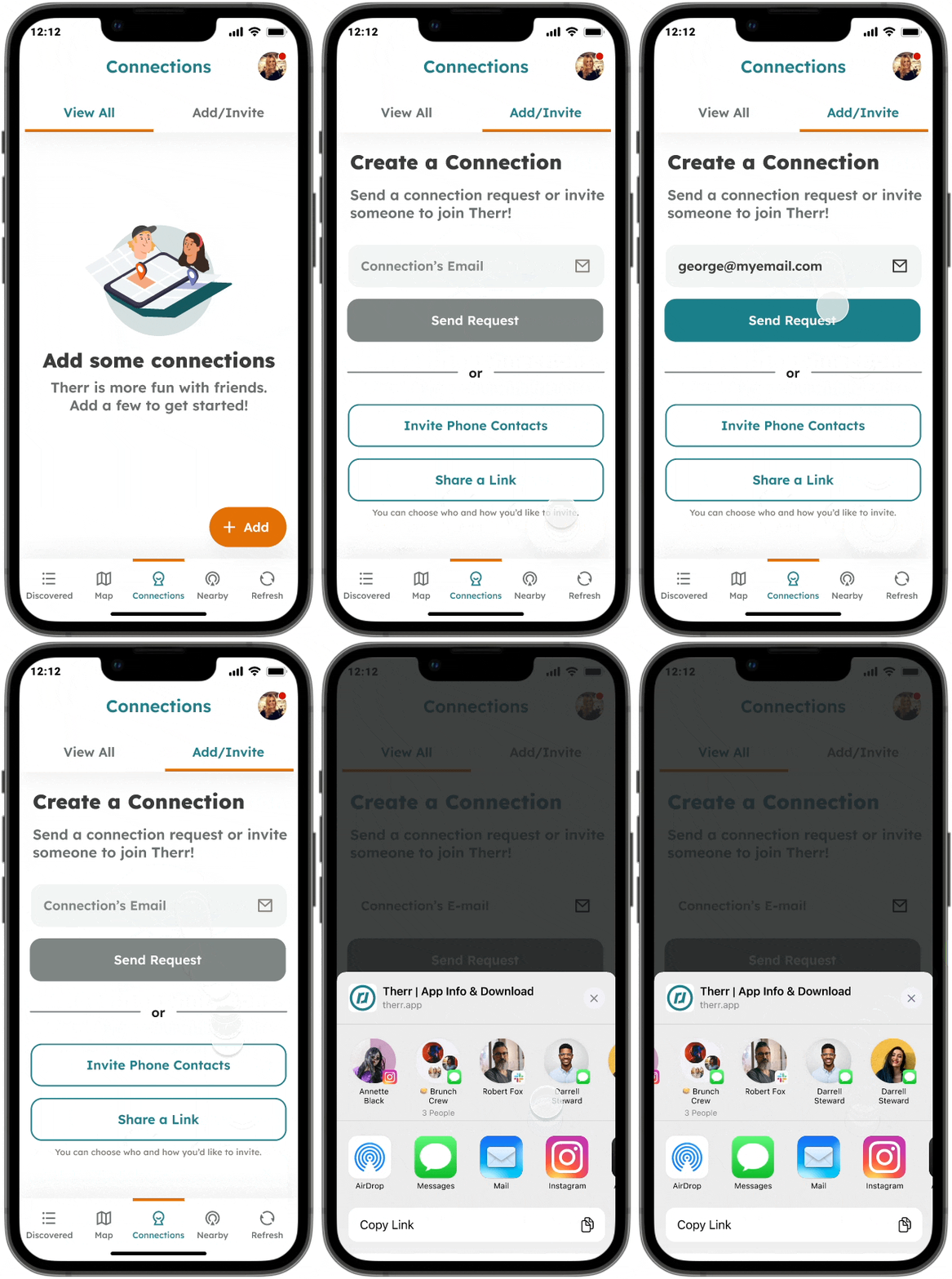
Utilizing contact lists
Users can utilize their phone’s contact list to efficiently invite the contacts that they choose.
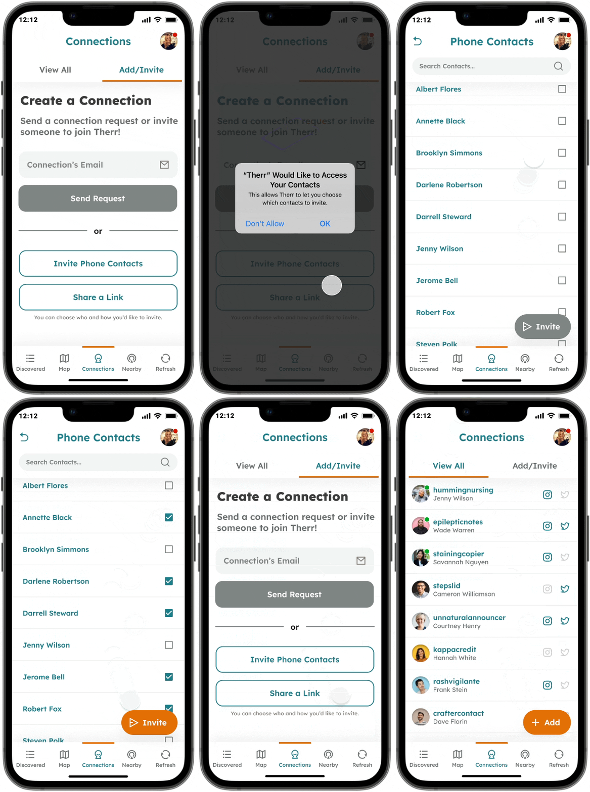
These design changes were well-received by users during testing, and will help enable Therr to reach its user growth goals.
What did I learn?
By working with the engineering team directly, I was able to understand how certain features may be implemented by utilizing existing React Native packages, rather than needing to be coded from scratch. This provided me with an understanding that it is not necessary to re-invent the wheel and there is increased efficiency in working with developers during design before implementation.
Part 3
Other Solutions
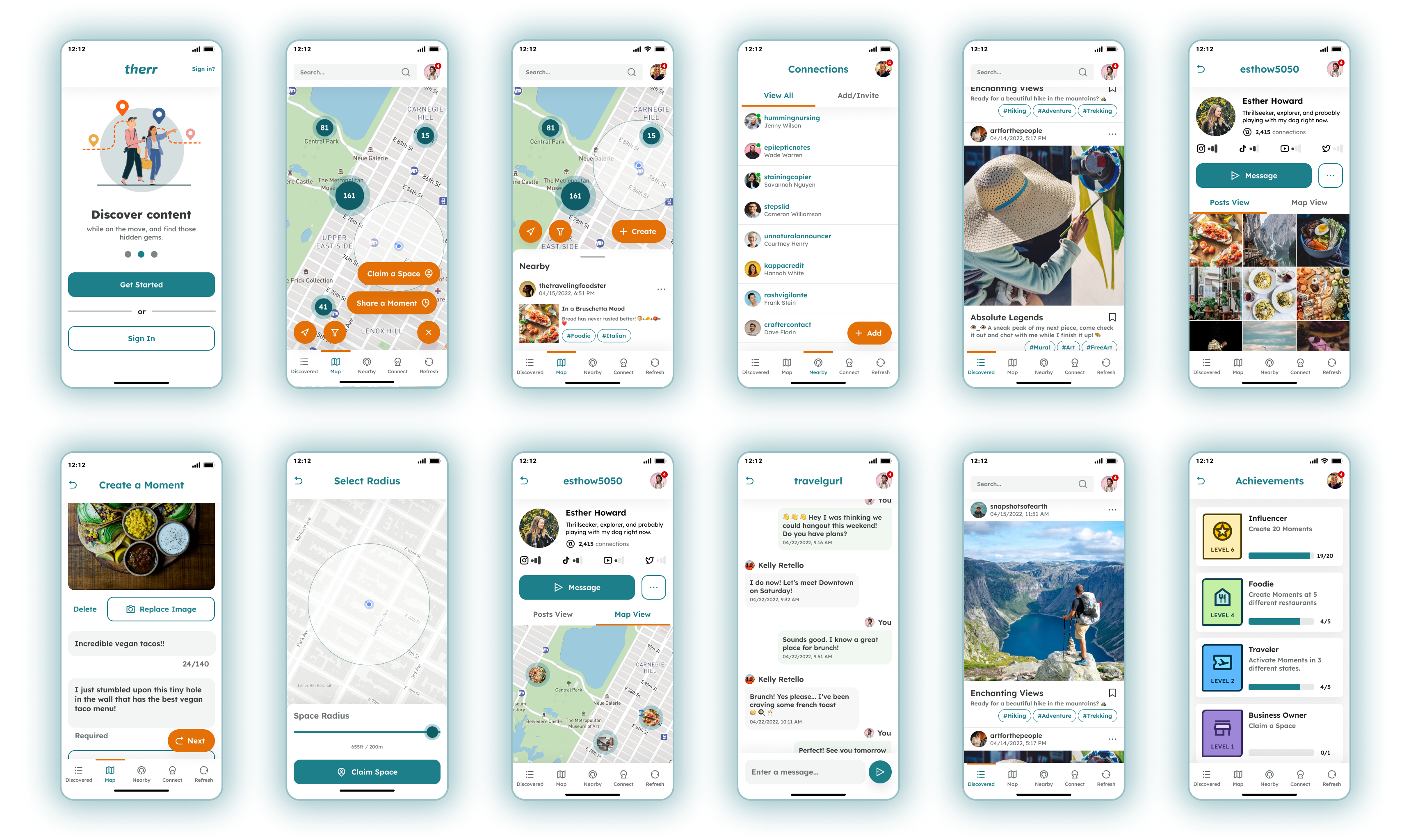
In addition to the flows shown above, there was an extensive amount of other screens and experiences that were designed for Therr, including user profile and newsfeed screens:
Part 3
Designing Dashboard Concepts
The long-term goal of Therr is to provide a DeFi token system and full B2B SaaS dashboard experience for advertisers and influencers to maximize their marketing efficiency. Concept images were required for use in a pitch deck to present these ideas to investors.
Challenges/Inspiration
A quick turnaround was the primary challenge of this project. As a result, we referenced existing dashboard and crypto usage patterns to inspire the design. Sources include: Snapchat, Twitter, Brave Browser, and Google Analytics Dashboards.
Results
The result was a few key screens that are used in the pitch deck to provide investors a glimpse of what the future vision would encompass. The design remains simple and intuitive by referencing existing successful design patterns.
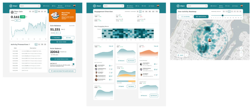
🔍 Concept screens for token, analytics, and map dashboards.

Vy took a simple concept and extrapolated into a full fledged concept design in just a few days. We had a strict deadline to present a plan and he quickly pivoted for the business needs in a way that drew interest and created excitement about the app.
Zack A.
CEO/Founder @ Therr

