Tools / System References
Figma, Google Material Design, iOS Human Interface Guidelines
Part 1
Improving Content Creation Core UX
The original design served its function as an MVP, but creating Therr’s design system involved considerations for improving accessibility and consistency.
What is the problem?
As an early stage startup, the primary goal of Therr’s MVP was to launch and iterate quickly. With speed-to-market as the primary concern there was no clear design system created at its inception. As a result, some components and design elements were inconsistent and lacked important considerations like contrast for accessibility.
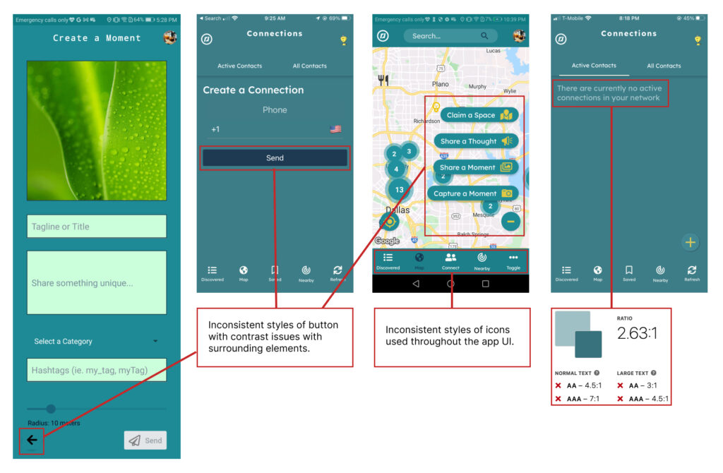
🔍 Design audit of previous app design highlighting inconsistencies and contrast issues.
What Did I Do?
Empowered to create the first design system at Therr, I sought to create the design system with a few primary goals in mind, including:
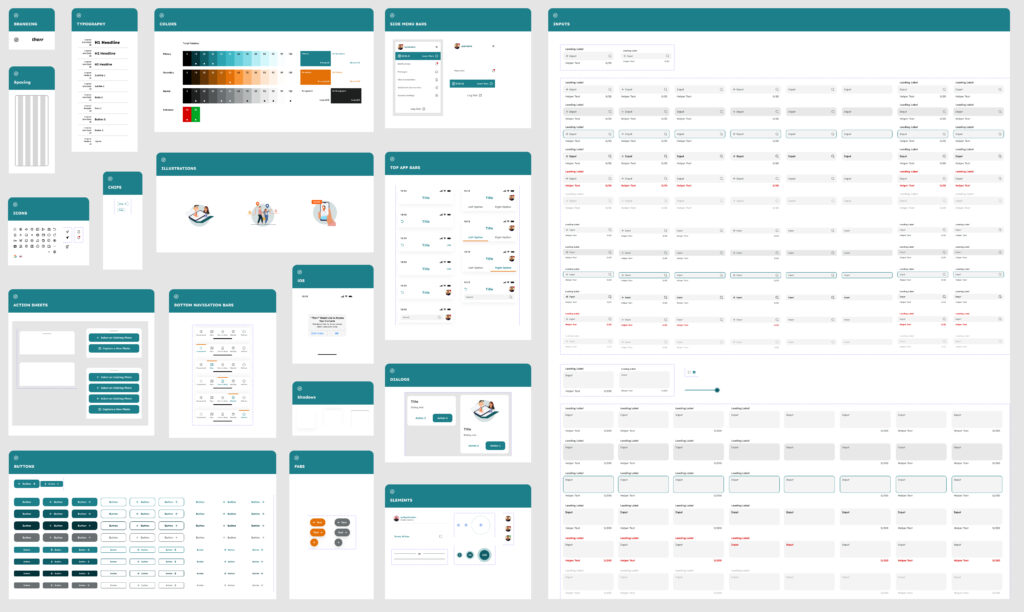
🔍 New V1 of Therr’s design system with consistency and accessibility in mind.
Colors/tints used
Components/variants created
WCAG compliance for accessible text
Using this new system, I updated the screens to address the problems that were identified. The result was a new UI that was more efficient, consistent, and accessible.
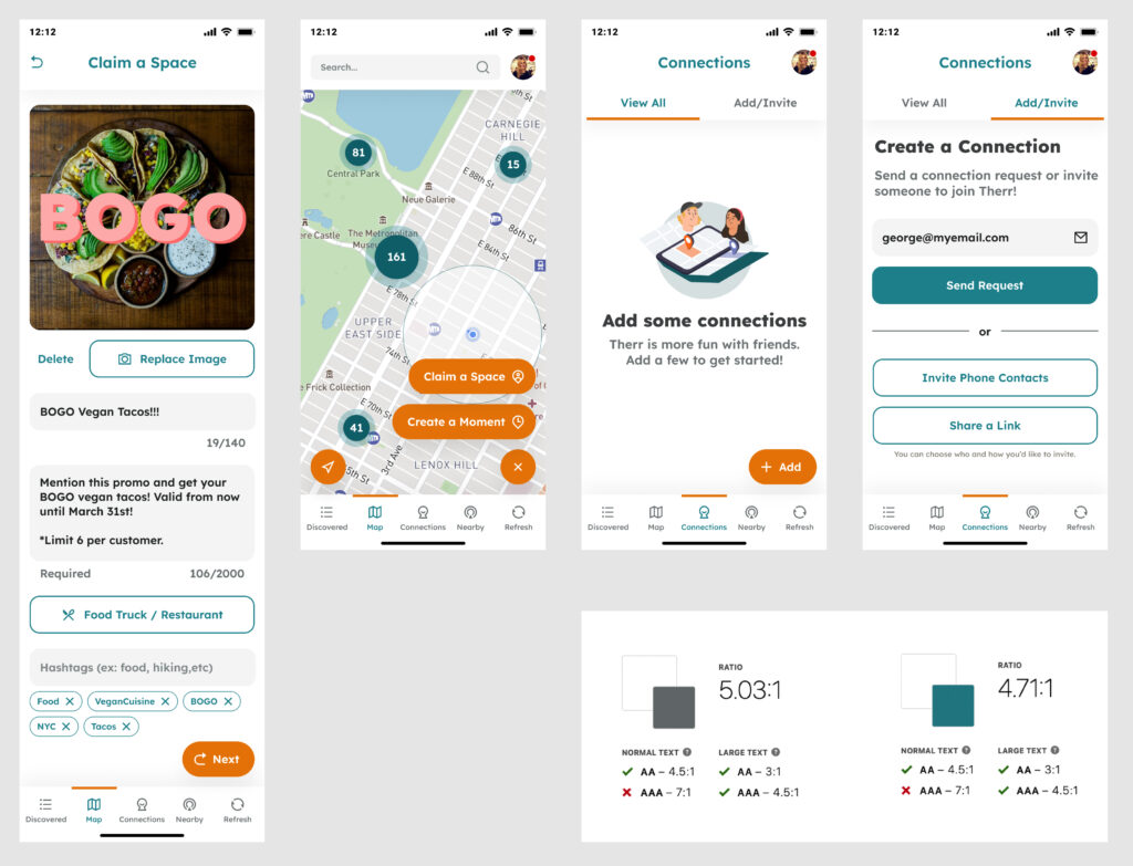
🔍 Updated UI with efficiency, consistency, and accessibility in mind.
What Did I Learn?
Making thoughtful decisions for the design system can create an impact without requiring developers to completely re-build the app. Building the design system may required a time investment initially, but reduced time during later design phases when components and styles could be easily re-used to build out other screens.

“Vy is a classic case of ‘the student becomes the teacher.’ He quickly adapted to our company vision and was able to deliver cohesive designs that moved us forward in leaps and bounds. He’s an expert at stepping into the user’s mind and asking the right questions during user testing. Along with creating great design work, he is also enjoyable to work with and a very fast learner.”
Zack A.
CEO/Founder @ Therr
Part 2
Updating Alike’s Outdated Design System
The design system was both outdated and over-complicated, negatively affecting design efficiency:
What is the problem?
The design system was created early on in history of Alike, but had not been properly updated in over a year. This resulted in app screens that contained excessive colors and font styles; while the design system had the opposite issue of missing elements.
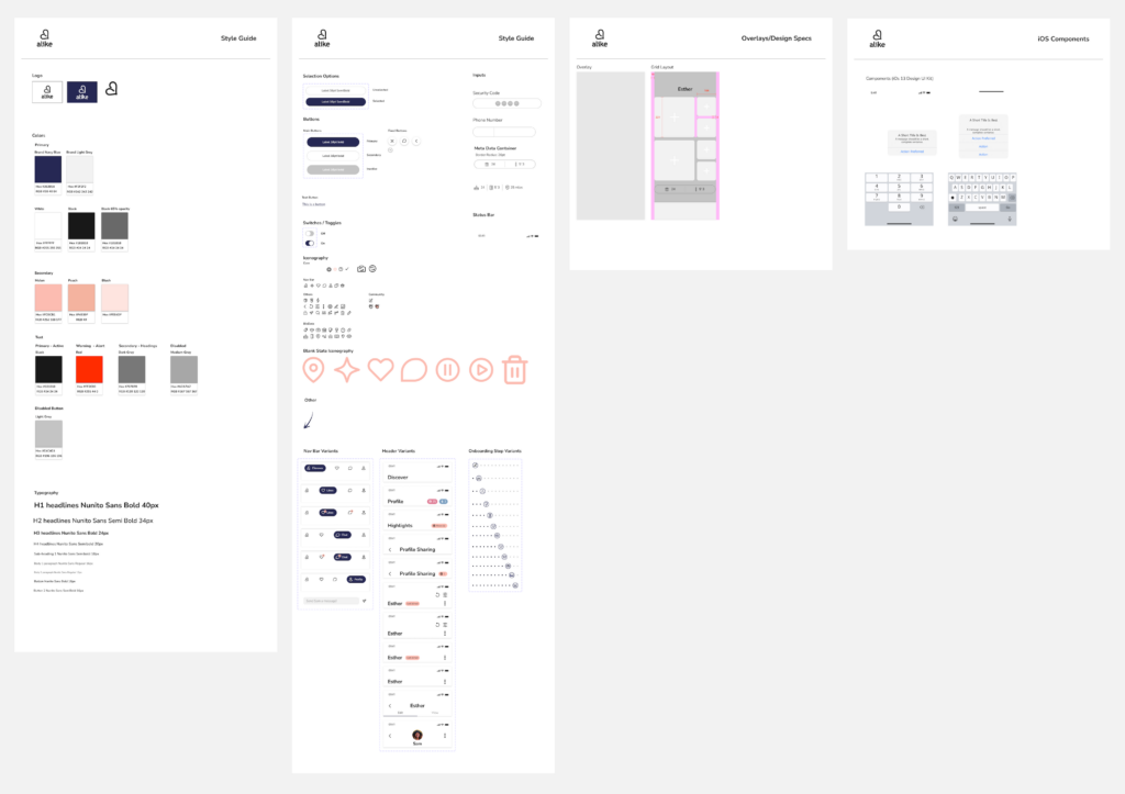
🔍 Previous design system with outdated content and missing elements.
Who is the user?
Because there is no in-house designer on the Alike team, I knew that the updated design system must be extensive and informative to the future designers who are onboarded. I looked to Uber’s Base Design System and Figma’s UI2 Design System as inspiration for Alike’s Design System overhaul. It served as an excellent starting point for understanding what design elements should/could be documented.
Figma’s Design System in particular contained more supporting copy, which informed the user on how to use each element. Because there is no in-house designer on the Alike team, I believed having supporting text in Alike’s Design System could be beneficial to future designers.
Different font styles
different colors/tints
Different shades of grey
Missing components
What did I update?
I accomplished the primary goals of this project by eliminating redundant design elements and updating the system to include missing elements. With this update I also incorporated supporting text to inform the users of when/how to use each element.
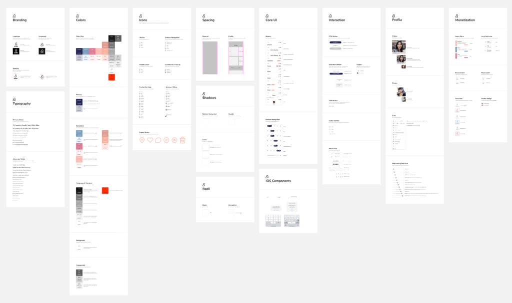
🔍 Updated Design System with updates, additions, and expanded support copy.
28
Different font styles
21
different colors/tints
8
Different shades of grey
0
Missing components
What did I Learn?
My main takeaway from this Design System is that it takes discipline to upkeep a design system over time, so that it does not fall into an outdated state that negatively affects design efficiency. I really enjoyed looking at other Design Systems for inspiration, and realizing that there is no “right” way to approach a Design System.

Working with Vy is simply a pleasure because he works fast, creates beautiful designs and gets the job done. His communication is excellent and simplifies the process, minimizing the back and forth. I highly recommend working with Vy.
Hanmin Y.
CEO/Founder @ Alike